

Justice Department pushes to break up Google’s search monopoly
The Justice Department has begun a three-week hearing to determine how to address Google’s illegal monopoly in internet search, with the government calling for major structural changes.
unbranded – Newsworthy
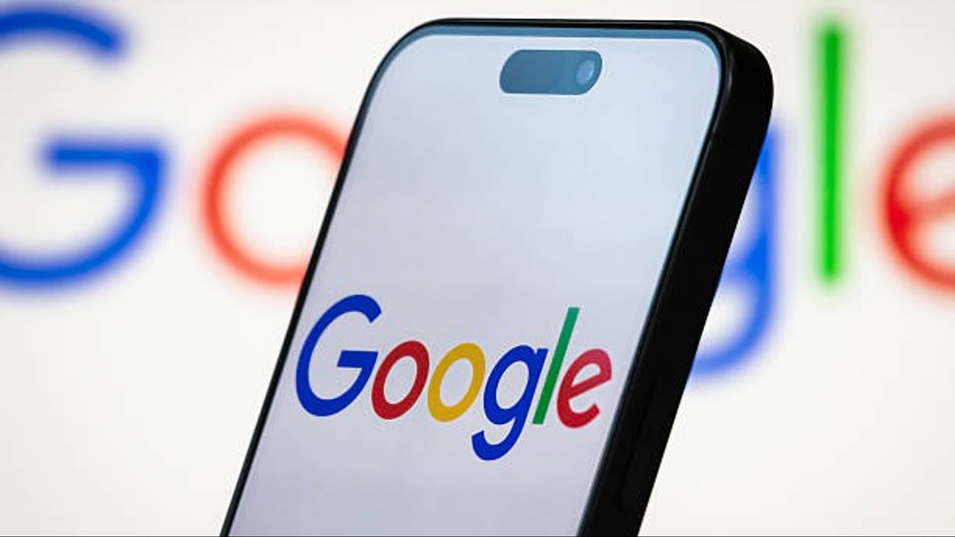
Google appears to have begun rolling out its first change to its “G” icon in nearly 10 years on May 12.
The icon was changed from having four solid color blocks in the letter to a gradient between the letters.
The new icon currently appears on the Google Search app’s icon on iOS and came with the 16.18 (beta) update for Android. The new mark has yet to appear in other branding elements for the company as of Monday.
It is unclear if other elements of Google’s branding will also be updated. USA TODAY did not immediately receive a response when it reached out to the company for comment.
The change comes days ahead of the Google I/O 2025 developer conference, set to begin May 20.
Evolution of the Google logo
The color-block iteration of Google’s “G” was unveiled in September of 2015.
At the time, the company changed its wordmark to a typeface called Product Sans and the icon from the lowercase white “g” on a blue background to the color-block “G,” according to 9to5Google.
“As you’ll see, we’ve taken the Google logo and branding, which were originally built for a single desktop browser page, and updated them for a world of seamless computing across an endless number of devices and different kinds of inputs,” the company said in a 2015 blog post announcing the change.
Earlier versions of the Google logo used a font that “evoked the traditions of the past while also being forward looking,” Ruth Kedar, the designer of the original Google logo, said in an interview with the company in 2023.